Monitor App Redesign Validation
Usability Study
Project Overview
This client is the world leader in international health & security risk management. With a suite of digital products and an extensive global network of emergency resources to help enterprise clients keep their well-traveled employees safe and alive.
Being the best for so long has put them in a difficult situation. Being a pioneer of their time, they had no competition for decades in the digital age. Now they are losing customers to newer, well-designed competitors with less international support resources.
With degrading tech stacks and very outdated digital experiences, we were hired to do a quick fix redesign of one of their flagship platforms for managers monitoring employee travel.
I was in charge of the usability study for testing the new design’s ease of use to existing users.
Responsabilities
Acting as Senior UX Researcher
- Working alongside a Visual Designer who was in charge of the design system integration, mockups, and prototype.
- Testing designs made by the visual designer and modifying prototype interactions based on testing scenarios.
- Collaborating with clients on testing tasks and objectives.
- Collecting, scheduling, and conducting test sessions.
- Analysis and gathering insights from sessions.
- Create a report of findings and recommendations.
- Implement approved recommendations to prototype.
Objectives
- To test the major UX improvements without changing much of the technical requirements and no changes to the APIs.
- Gather insights for the future product rebuild.
Timeline
- 5 Interviews / 3 days
- Gathering Insights / 1 day
- Report Creation / 2 days
Results & Outcomes
Testers
%
Completion Rate
Major Findings
Existing Platform
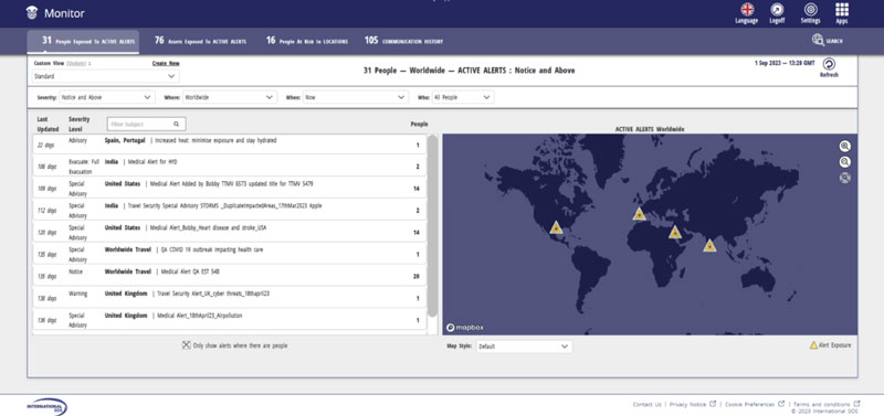
The current platform was decades old and didn’t have a designer at the time of its inception.
Customers often complained of how outdated it looked and how slow or unresponsive the experience was.
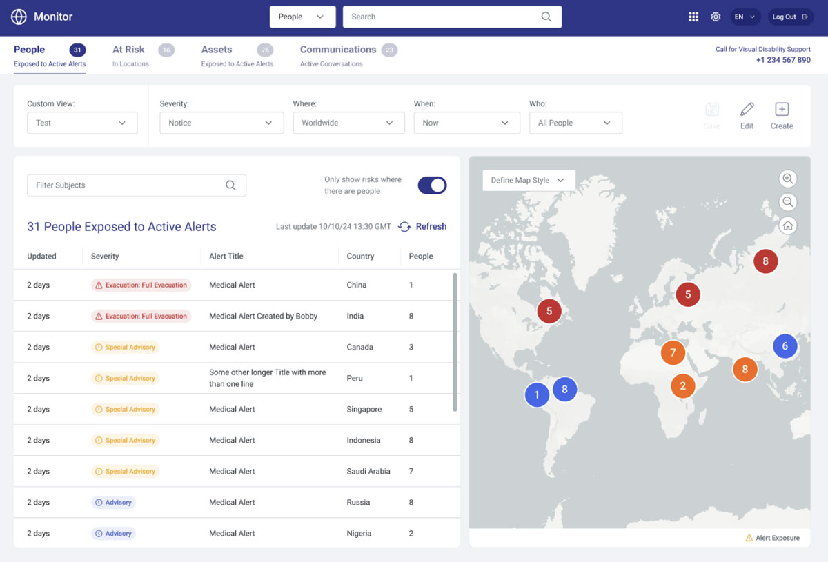
A Fresh New Look
With no API changes and minimal technical changes, we were able to create a modern platform for managers.
Major areas of focus for improving the experience were using more color to signify immediate threats, giving more breathing room to elements, and better organize content in a more digestible way.
Test Preperation
Gathering users from the client resource teams, I used Userinterviews.com scheduling services to set up appointments with my testers.
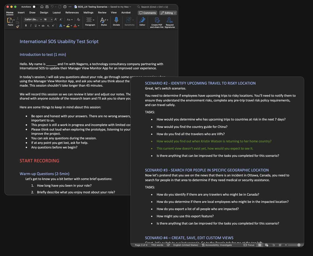
I gathered testing requirements from stakeholders, created a set of tasks for the user to complete based on common scenarios that a user would encounger, and wrote the script accordingly.
By testing specific scenarios, we aim to cover the most valuable features of the application, creating a realistic mindset that mirrors the tasks users commonly undertake within the platform.
- Responding to an incident
- Identify upcoming travel to risky locations
- Search for people in specific geographic locations
- Create, save, and edit, custom views
Testing Analysis
I use a variety of tools to help speed up the process of gathering insights for usability tests.
I first import the videos into Dovetail, a digital insights hub to collect and analyze data faster into actionable insights. When adding the user test recordings, I tag verbatims of the recording that are then collected into categories of findings or themes.
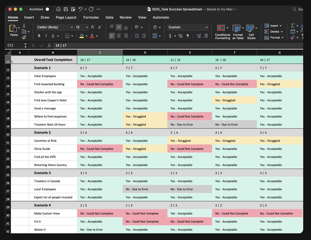
I then reviewed the findings and compared them to my task completion grid in Exel to give me an overview of the task completion rates and visualize emerging patterns.
The Report
The report focused on 7 main themes:
- A Fresh New Look
- UI Theme Preference
- Custom Views are Not Intuitive
- Most Users Struggled to Find Assets
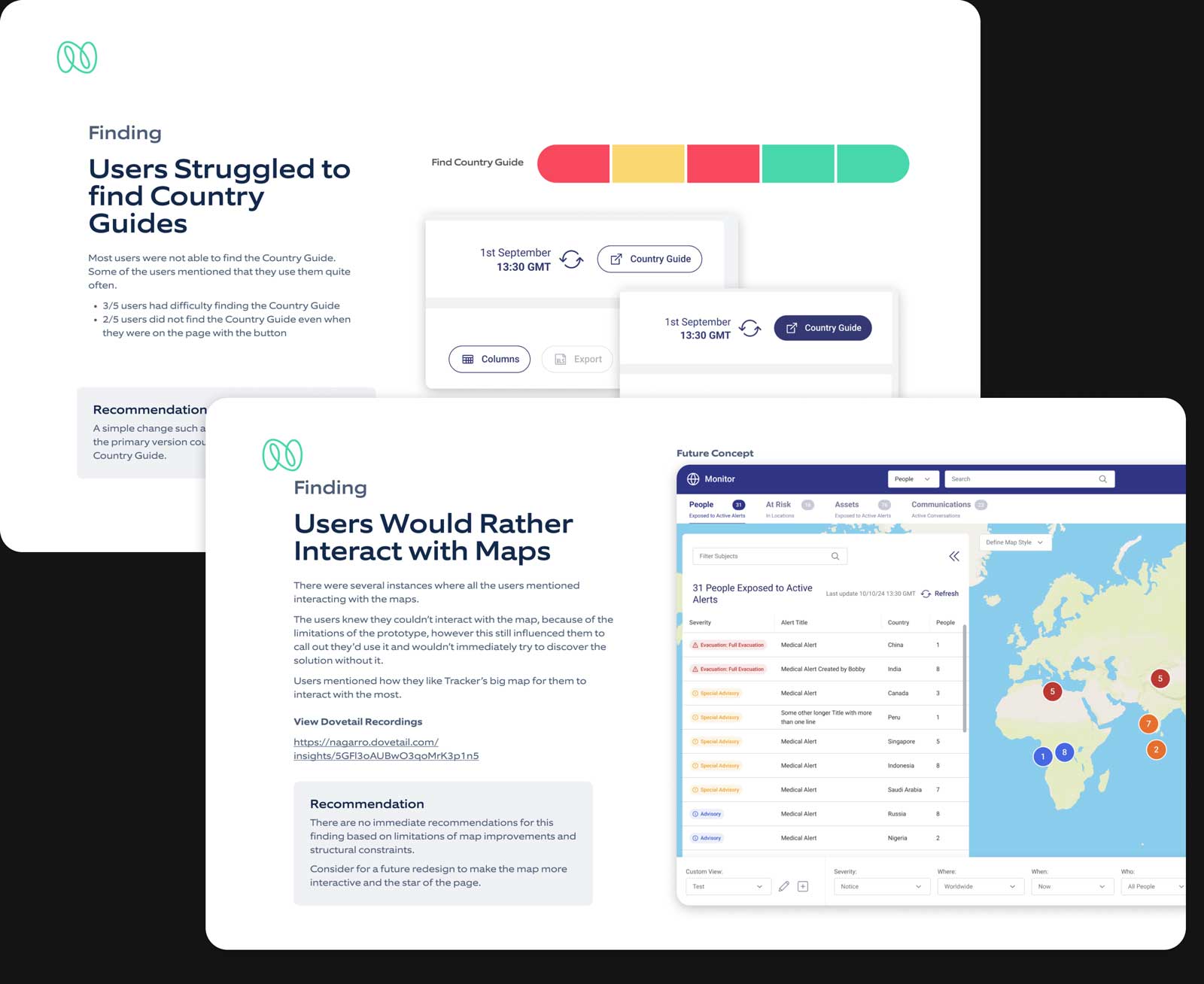
- Users Would Rather Interact with Maps
- Users Struggled to find Country Guides
- Other Small Findings
I then spend a couple of pages on each topic describing the problems and recommendations. My analysis goes over visual cues, and verbatims while catching subtle hints of struggle.
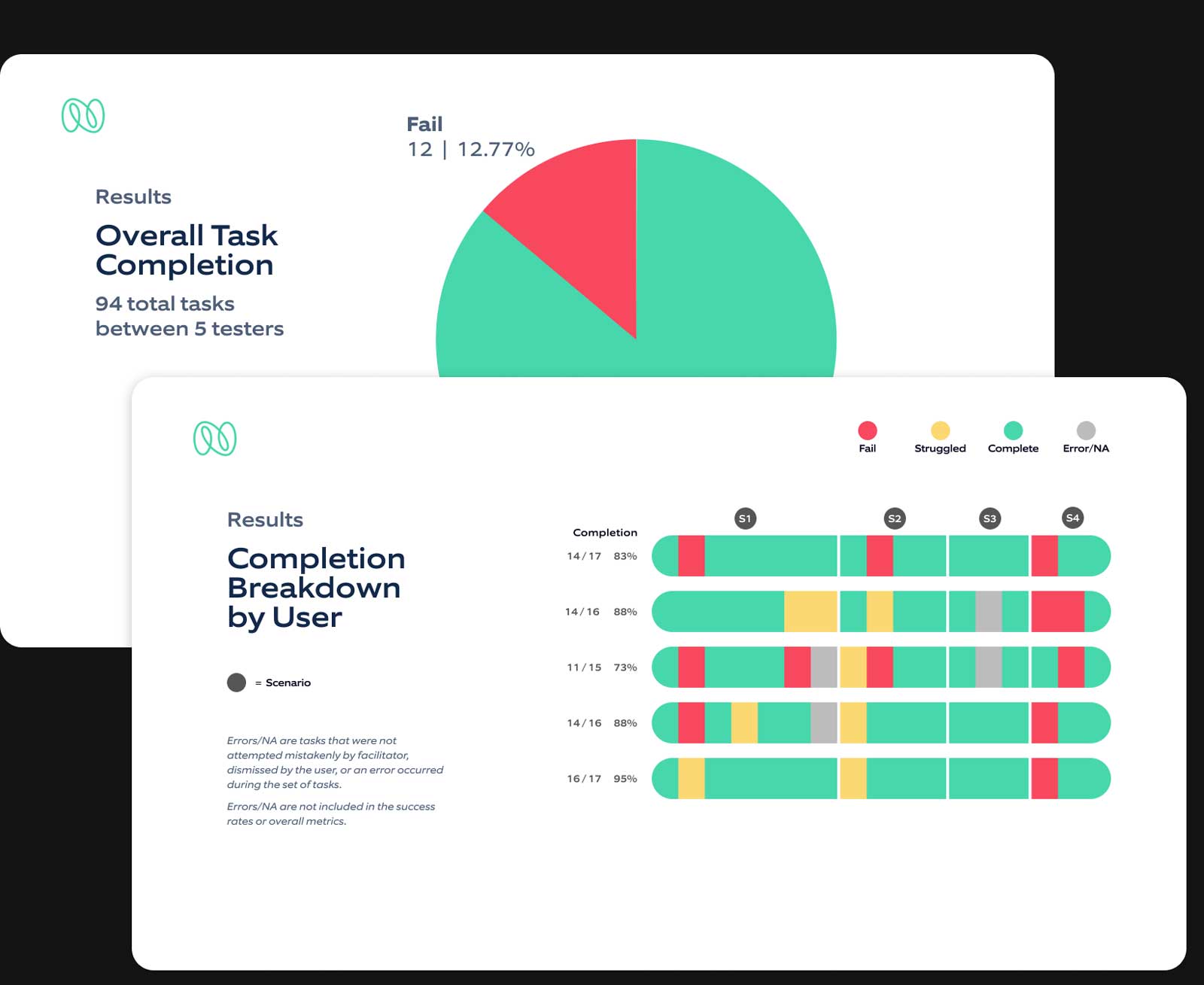
I also hand-created data visualization of the breakdown of testing scenarios, tasks, and individual completion rates.
There were three problem areas that needed to be addressed, however, they were all minor tasks that were secondary.
To view the full report, please request it for a portfolio review.
Results & Outcomes
After conducting the usability test, our findings revealed a predominantly positive response, unveiling a few problematic patterns. Adjustments to the mockups were minor, and we successfully validated our designs with stakeholders, instilling confidence in the client’s commitment to upgrading its technology.
Currently, we are engaged in a contractual partnership to further enhance and modernize additional applications of their digital product suite.

